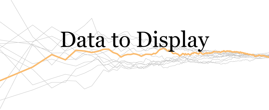
The homepage of this site currently features the “interactive” banner above. By interactive I mean you can click on it and the lines will be regenerated, though you don’t have any control over what it is that is drawn. So what is it?
The whole idea came from an article I wrote for Infragistics called “Visual Explorations of Sample Size“. The image below is the precursor to the banner above:

All the lines used in this chart were constructed from a random sample of the normal distribution with a mean of 3.917 and a standard deviation of 0.720. The vertical axis just plots the mean of the first n points, where n goes from 2 to 10,000. The horizontal scale then shows the log of n (on a linear scale the data is fairly useless). Despite coming from the same distribution, the lines look quite different when n is small, but converge to the mean of the distribution as n gets bigger. In short, the chart demonstrates the law of large numbers. There’s nothing particularly special about the green line, it was just the first sample (though it’s plotted last).
For the banner at the top numbers were drawn from the standard normal distribution and the lines include n = 1, which was omitted from the Infragistics article so that one could compare with how the sample standard deviation (which is infinite for n = 1) changed. More obviously, the axes, axes labels and titles are omitted from the banner. This is something of a cardinal sin of data visualisation, hence the reference to “data art” in the title. The chart below adds these essential items back in (with the “Data to Display” text greatly faded).
There are only 300 points per line rather than 10,000 because large numbers of points made the animation of the lines rather jumpy on some mobile browsers.
Note that “Data to Display” is slightly above the 0 point. This means that the orange line is more likely to be below than above the text and on occasion will create a nice underline effect through the descenders. That’s very much pot luck though, which is part of the fun of random number generation. (If the user’s browser doesn’t support SVG or JavaScript is disabled for some reason then they’ll just get this static image.)
The original chart for the Infragistics article was created with R, while the two versions of the banner were created using d3.js.