Examples
Click on any title or image to view the example.
Life Expectancies Across the World

Explore how life expectancy varies throughout the world and over time for both men and women with this interactive graphic using World Health Organisation data. Data is plotted by country and can be filtered by continent and region.
2011 Census Map
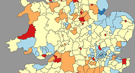
Select any one of 89 different measurements from the 2011 census of England and Wales and view the data encoded in a map and displayed in a linked, sortable, table.
Quest for Autism Biomarkers Faces Steep Statistical Challenges
Change parameters of a hypothetical screening test and see the effect on the positive predictive value. Includes explanatory animations and definitions of important terms. (External.)
Ranking G-20 Nations by CO2 Emissions
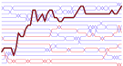
Bumps charts and slopegraphs that allow the user to explore how the carbon dioxide emissions of G-20 nations have changed relative to each other since 1960. A simple highlighting mechanism is built in to the designs to assist with the disentangling of criss-crossing lines.